Interior design studio
Needed an elegant, editorial site that books high-end consultations. Built a premium image-led site with project galleries and a consultation booking flow.
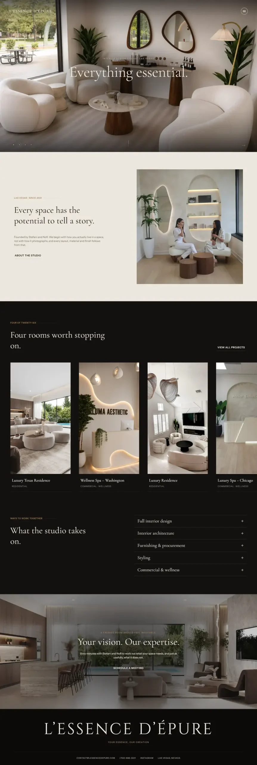
L’Essence d’Épure is an interior design studio in Las Vegas working at the high end of the market. The work was already there. The problem was everything that happens before a client ever sees it.
High-end interior design is not bought from a services page. It is bought after someone has looked at enough of your work to believe you can do it for them, and then felt comfortable enough to have a conversation. The old setup was not carrying either half of that. Projects were hard to browse properly, the site did not feel like the standard of the work it was showing, and there was no clean path from “this is beautiful” to “let’s talk.”
There was also a positioning problem underneath it. When a studio charges premium rates, the website is part of the proof. A site that feels ordinary quietly argues that the pricing is optional.
Let the work lead, everywhere. The home page opens on the projects themselves, full-bleed, with almost nothing competing for attention. The line that sits over it, “Some spaces are beautiful. Others are unforgettable,” does the positioning in nine words, then gets out of the way. For a visual business, restraint is the design.
Before and after as the core proof. Interior design has a natural advantage most businesses do not: the transformation is undeniable. We built the project galleries around that rather than treating it as a nice extra, because it answers the only question a prospective client is really asking.
A structure that matches how people actually decide. Projects first, then Services, then About, then a dedicated FAQ. That order is deliberate. Nobody reads the about page of a studio whose work they have not been impressed by yet, and the FAQ exists to quietly clear the practical worries, timelines, process, what a project involves, that otherwise stop someone booking.
Consultation as the single next step. Book Your Consultation sits in the main navigation and is the only real call to action on the site. No quote forms, no price lists, no competing buttons. For a service sold on trust and taste, the conversation is the conversion, and everything else is a distraction from it.
Editorial typography and generous space. The type is set large and calm, with a lot of room around it. That sounds like a small decision. It is most of what separates a premium studio site from a template with nice photos in it.
Built on WordPress with Elementor, so the studio can add new projects themselves as the portfolio grows, without needing me for every update.
The studio now has a site that matches the standard of the work, which for a premium service is not a cosmetic point. It is the thing that makes the pricing feel reasonable before anyone says a number.
Practically, three things changed. Prospective clients can browse the portfolio properly, which is what actually does the selling. The path from interested to booked is one step instead of a hunt for contact details. And the FAQ absorbs the routine questions that used to arrive by email, so the consultations start further along.
The site is also theirs to grow. New projects go up without a developer, which matters for a studio whose portfolio is the product.
It sits alongside AFAM Design in my work as proof of the same idea: for high-end service businesses, the website is not a brochure. It is the part of the sales process that runs while you are asleep.